Themify Builder

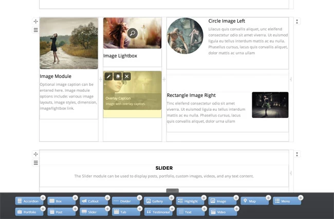
All Themify WordPress themes now include the ability to create designs for your website by dragging and dropping. Build beautiful, responsive layouts that work for desktop, tablets, and mobile using our intuitive ‘what you see is what you get’ drag & drop framework with live edits and previews.

Get it Now

Themify’s drag & drop framework is now included in all themes

Browse Themes

Builder Features

Themify Builder is super easy to use. To start: simply dorp in a module, configure the options and the actual content will appear instantly on the page. You can then rearrange the content block, rows, and grids by dragging. It works with static content (text, images, videos, etc.) and dynamic content such as displaying posts from the database or running shortcodes.
Live Edits & Previews

Themify Builder is super easy to use. To start: simply dorp in a module, configure the options and the actual content will appear instantly on the page. You can then rearrange the content block, rows, and grids by dragging. It works with static content (text, images, videos, etc.) and dynamic content such as displaying posts from the database or running shortcodes.
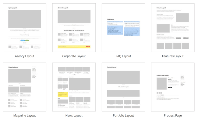
The layouts that you can build with Themify Builder are unlimited. Check this demo site that we built with Themify Builder. You can design any layout type from a simple portfolio page to a business homepage or large complex grid layouts.

What Can You Build With The Builder?

The layouts that you can build with Themify Builder are unlimited. Check this demo site that we built with Themify Builder. You can design any layout type from a simple portfolio page to a business homepage or large complex grid layouts.
Responsive designs that work on desktop, tablet, and mobile browsers. Nullam facilisis non massa eu dapibus. Nulla commodo varius neque, convallis venenatis odio ultrices in. Etiam interdum molestie quam nec dapibus. Aenean dictum volutpat luctus. Nulla at varius metus. Sed lacinia viverra eros, eget imperdiet est commodo eu.


Responsive

Responsive designs that work on desktop, tablet, and mobile browsers. Nullam facilisis non massa eu dapibus. Nulla commodo varius neque, convallis venenatis odio ultrices in. Etiam interdum molestie quam nec dapibus. Aenean dictum volutpat luctus. Nulla at varius metus. Sed lacinia viverra eros, eget imperdiet est commodo eu.

Showcase

  • Slide One

    Slide One

  • Slide Two

    Slide Two

  • Slide Three

    Slide Three